Unofficial Concept
Stager 3.0
How could Adobe Stager be improved? Using the design framework Step-Stretch-Leap, below are three redesigned versions of Stager featuring increasing departures from the status quo.
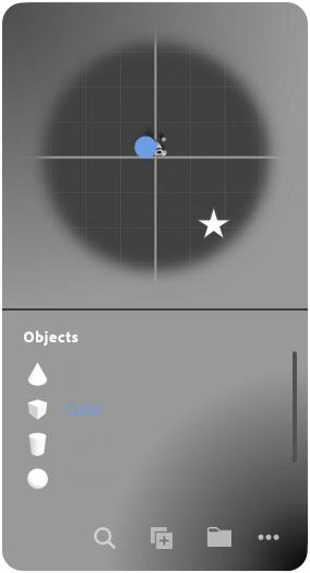
Stager is a 3D rendering tool. In other words, a tool to help people who already have 3D objects customize and compose them as 2D images.
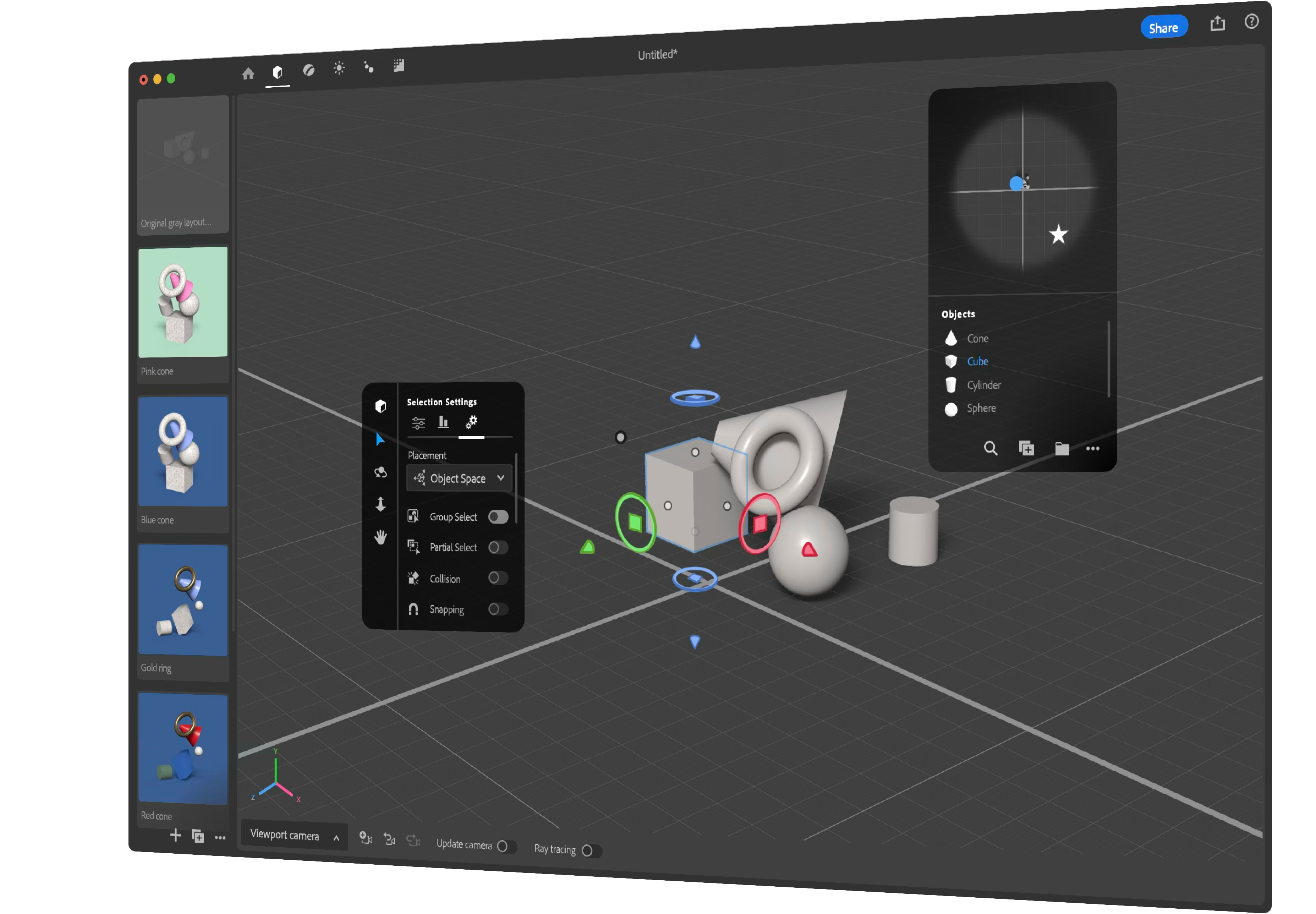
Left is Stager 2.0 (2024) compared to proposed 3.0s (right) which would overhaul the UX to varying levels.
This page is best viewed on a large screen. On a phone, press the note to see what it refers to. If you have a mouse, simply hover over the notes.
Step >> Stretch >> Leap
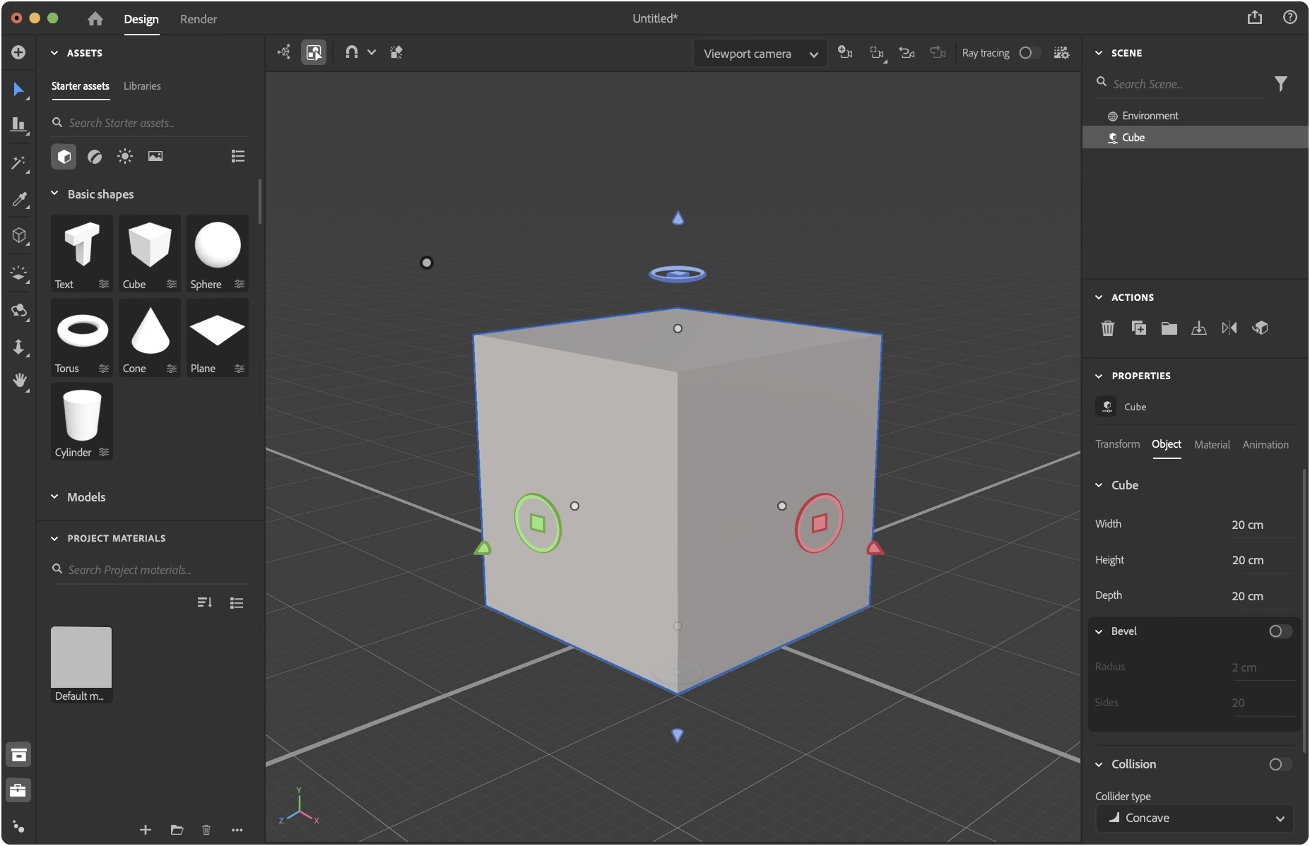
- Removed Pan & Zoom from the toolbar. // Hypothesis: the current implementation is more confusing than useful.
- Updated icon(s)
- Replaced icon to make it consistent with Spectrum, the Adobe Design System.
- Align: use the conventional icon. // Hypothesis: the custom icon is less recognizable as align and more confusable as an ostensible 3D graphing tool.
- Eyedropper: use the conventional icon. // Hypothesis: the eyedropper functions similarly enough with conventional expectations.
- Replaced the 4-way-arrow icon with a Hand. // Hypothesis: The Hand would create a more accurate expectation than the current design, that is likely confused with object translation or movement.
- Redesigned the Text (basic shape) thumbnail to show a San Serif “T” for a modern aesthetic.
- Redesigned the camera-undo icon so the camera symbol faces a consistent direction. // Hypothesis: Its currently likely to be confused with flipping the camera angle, rather than undoing a camera movement.
- Redesigned the cube-parameter icon so that the parametric bar is more consistent with the the parameter icon.
- Implement Modeler’s Gizmo. // Reasoning: it’s more modern and the Substance 3D apps should evolve to share consistent fundamental interactions. // Hypothesis: Because the Gizmo looks less like the axis-indicator, people will be more likely to click on the axis-indicator to discover its interactive.
Step >> Stretch >> Leap
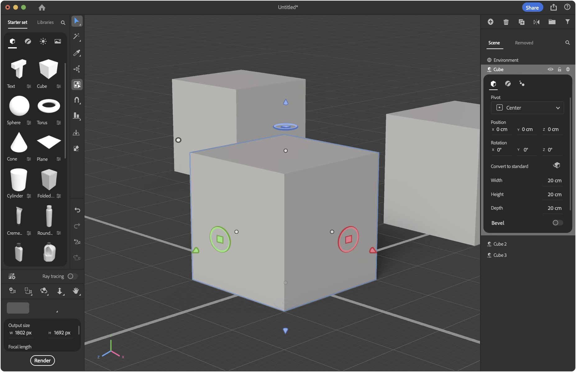
- Redesigned Toolbar.
- The toolbar is closer to the viewport. // Hypothesis: Substance Painter users may find the move strange. However other Adobe customers, such as Adobe Premier Pro users, may find the toolbar faster and understand the purpose of the Asset library more easily.
- The tool-options are on the toolbar. // Hypothesis: Having the selection options share the same space with the tools, rather than the camera-dropdown, provides more accurate hints regarding its purpose.
- Surfaced undo and redo. // Hypothesis: Seeing the tool-undo separately from a camera-undo makes it clearer that there are two different undos.
- Redesigned Assets.
- Starter assets in the upper-left. // Reasoning: Western design trains people to start by looking in the upper-left. Because adding assets is first step in Stager, it should be in the upper left.
- Fewer section headings. // Hypothesis: They take up space while providing unnecessary instructional value. // Reasoning: For example, two headers within Models are “Basic Shapes” and “Models.” The lack of size and diverse categories makes it unnecessary.
- Relegated asset search. // Hypothesis: People don’t often search for assets by name.
- Redesigned Rendering, Cameras, Navigation tools.
- Camera-undo near the tools it can undo.
- Camera-options is near the navigation tools. // Hypothesis: Because navigation always changes a viewport or camera, placing them closer together will help people understand the link faster.
- Large(r) Axes-indicator. // Hypothesis: Making the axes-indicator larger (while near the navigation tools) will make it more likely people will learn to interact with it.
- Render button is near the camera properties. // Hypothesis: The current design with the blank Render page is an experiential let-down. Also, having Render-button next to the camera properties will make changing the rendering resolution more ergonomic.
- Redesigned Scene Outliner.
- Scene-outliner organization tools are grouped-together (add, delete, duplicate, reflect, group, filter). // Hypothesis: The original design was more confusing as it scattered conceptually redundant buttons under Actions and Project Materials.
- Project Materials is near the scene-outliner. // Hypothesis: People don’t assume Project Materials literally means only 3D materials. Also, the main benefit of the Project Material section is for reusing previously discarded scene assets.
- Relegated Scene Search // Hypothesis: People seldom search a scene for an asset by name.
- Properties of an asset is displayed within the context of the scene-outliner. // Hypothesis: People will be less liable for misunderstanding the connection between a selected asset and the property panel.
- Conceptually related tools and features are moved closer together without drastically changing Stager’s interface. The consequence frees-up space to showcase more of the main content in the viewport.
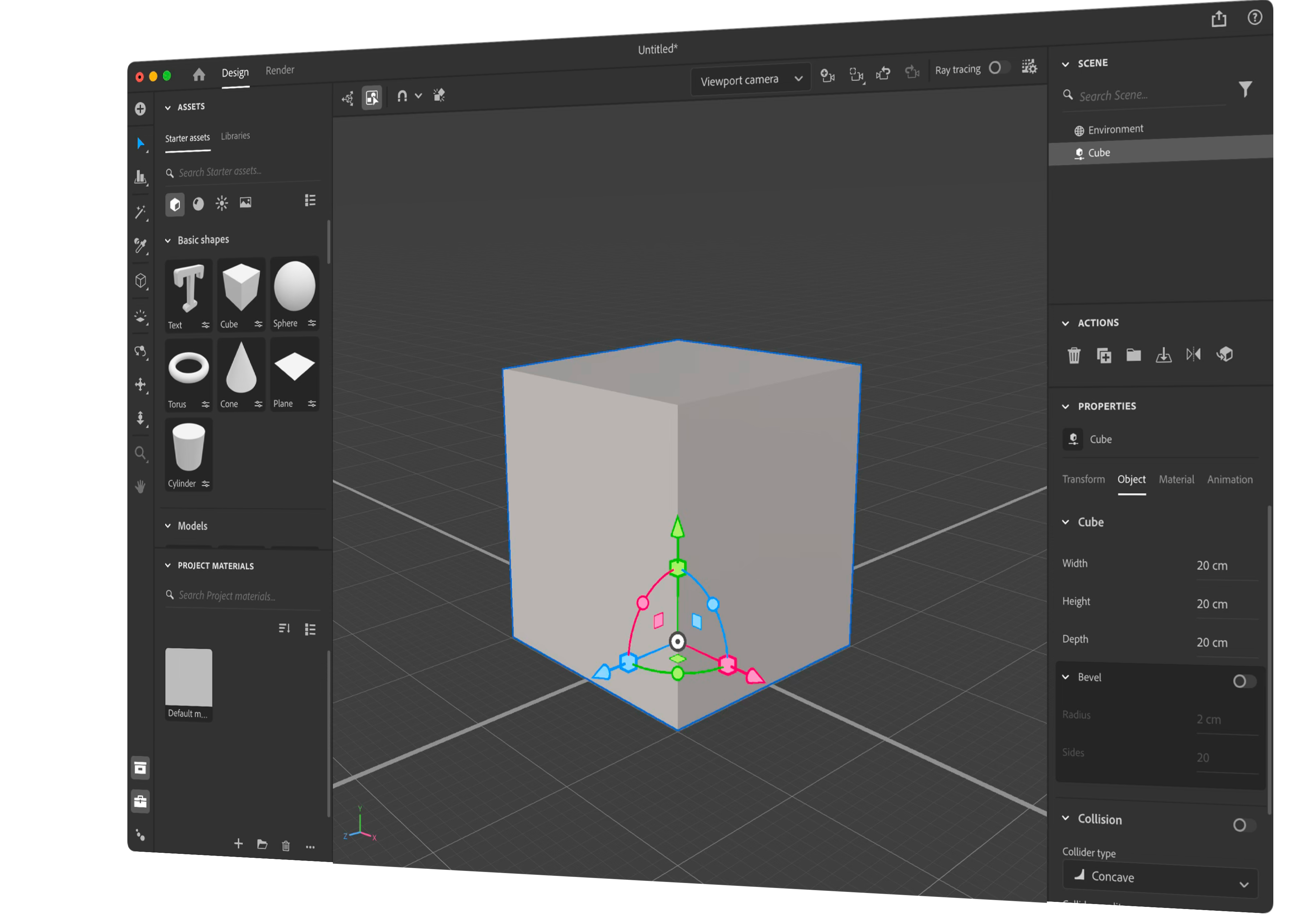
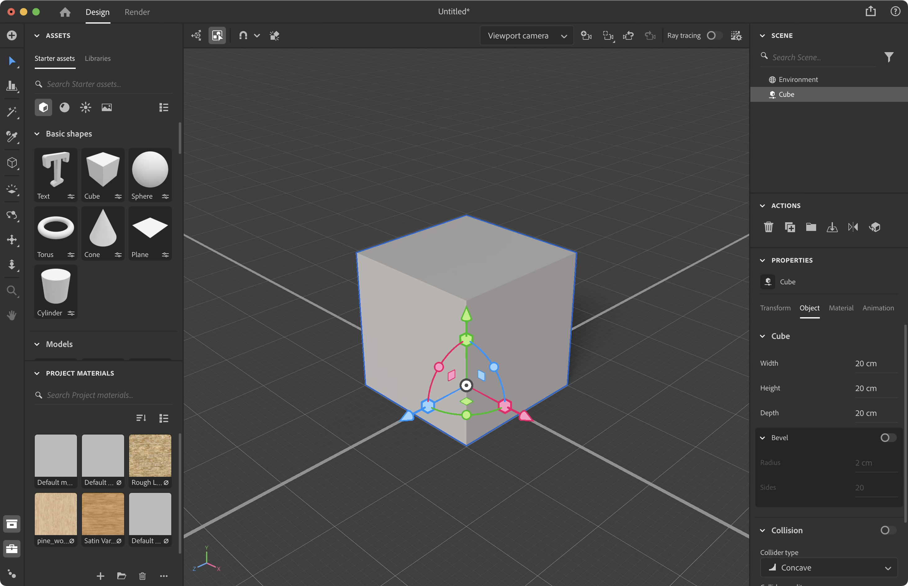
- Consistent Design Elements.
- Available tools (e.g., Arrow, Eyedropper, Hand, Delete) are shown on the level of the base UI; a middle-toned background color.
- Active elements (e.g., Active tool, group-select-on, selected-object, view) are highlighted.
- Current-among-optional-categories (e.g., Models-assets, Object-properties, Scene) are underlined with a horizontal white bar.
- An active category or element’s options are shown with a darker background.
- Removed are the nested drop-downs—which lack in sufficient visual hierarchy—along with controls customizing the user-interface.
Step >> Stretch >> Leap
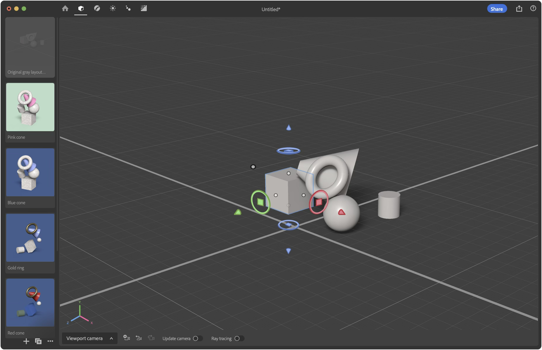
- Floating panels above the variation-navigator and viewport; it’s like an artist’s palette hovering over a canvas. // Reasoning: A VR-ready design that shares a design language with Modeler. // Hypothesis: Having panels separated from the viewport makes them more salient. Also, a more modern aesthetic.
- Embracing Stages. // Hypothesis: Neophytes don’t know where to begin, how to make things look good, and are easily overwhelmed by the process of 3D rendering. Segmenting the interface according to the normative stages of professional use will make it easier to learn and remember how to 3D render.
- Objects
- Materials, Decals, Stickers
- Lighting
- Animation
- Render
- Contextual Palettes: active elements (objects, materials, lighting, animation, rendering) changes the palettes to bring the most appropriate tools up-front to the user. // Reasoning: A design with space to grow and accommodate new features for rendering specialists (e.g., gray boxing, rigging, lighting design, etc.) in the future. Also, splitting rendering into stages will make synchronous collaboration of a single USD file easier. // Hypothesis: Neophytes will find this design more approachable. Experts may find it tedious on first impression, but not after learning hotkeys to quickly switch between stages.
- Tool Palette: All the features, tools, properties, and options affecting content within the viewport (e.g., adding a model, selecting an asset, camera movement) are located here.
- List of asset in the scene while providing another way to find, select, and organize them conceptually.
- Top-down map. // Hypothesis: People familiar with video games or smartphone maps will understand the scene and navigate it faster when given a top-down map.
- Thumbnail previews of the asset. // Hypothesis: Possibly computationally expensive and liable for imperfections, having imperfect thumbnails would be welcomed over generic icons.
- Find the asset in the outliner after selecting the Object. This is a feature in Adobe Illustrator.
- Camera options.
- Located near the axes-indicator and attached to the viewport. // Hypothesis: Relocation increases the likelihood people will discover the axes-indicator is interactive and that the view is linked to a camera.
- Update Camera. When off, changes to the view will not be saved, nor restored upon returning to a scene or camera. // Reasoning: A feature to preserve a camera’s view without preventing people from making informal camera maneuvers.
- Explore variations (e.g., models, materials, lighting, animation, camera angles) of a scene flexibly. This obviates a need for storing removed assets (e.g., Project Material’s panel) while providing more flexibility. // Hypothesis: People will have more fun when they can worry less about the cost of exploring variations. Also, users value working within the macro context of a project.
- A deeper UI structure frees up screen-space for new features such as a variation-navigator and map.
Working with Stager’s team, my focus was on new features. This exercise to redesign the app was done after departing the team and does not contain confidential information or Adobe IP.


Unofficial Concept
Stager 3.0
How could Adobe Stager be improved? Using the design framework Step-Stretch-Leap, below are three redesigned versions of Stager featuring increasing departures from the status quo.
Stager is a 3D rendering tool. In other words, a tool to help people who already have 3D objects customize and compose them as 2D images.
Left is Stager 2.0 (2024) compared to proposed 3.0s (right) which would overhaul the UX to varying levels.
This page is best viewed on a large screen. On a phone, press the note to see what it refers to. If you have a mouse, simply hover over the notes.
If Stager 3.0 were to update only a few design elements, what would a refinement look like?
Step >> Stretch >> Leap
- Removed Pan & Zoom from the toolbar. // Hypothesis: the current implementation is more confusing than useful.
- Updated icon(s)
- Replaced icon to make it consistent with Spectrum, the Adobe Design System.
- Align: use the conventional icon. // Hypothesis: the custom icon is less recognizable as align and more confusable as an ostensible 3D graphing tool.
- Eyedropper: use the conventional icon. // Hypothesis: the eyedropper functions similarly enough with conventional expectations.
- Replaced the 4-way-arrow icon with a Hand. // Hypothesis: The Hand would create a more accurate expectation than the current design, that is likely confused with object translation or movement.
- Redesigned the Text (basic shape) thumbnail to show a San Serif “T” for a modern aesthetic.
- Redesigned the camera-undo icon so the camera symbol faces a consistent direction. // Hypothesis: Its currently likely to be confused with flipping the camera angle, rather than undoing a camera movement.
- Redesigned the cube-parameter icon so that the parametric bar is more consistent with the the parameter icon.
- Implement Modeler’s Gizmo. // Reasoning: it’s more modern and the Substance 3D apps should evolve to share consistent fundamental interactions. // Hypothesis: Because the Gizmo looks less like the axis-indicator, people will be more likely to click on the axis-indicator to discover its interactive.
A ‘stretch’ of a redesign that clusters tools with similar function, uses space more efficiently, and becomes more consistent with Adobe’s design system.
Step >> Stretch >> Leap
- Redesigned Toolbar.
- The toolbar is closer to the viewport. // Hypothesis: Substance Painter users may find the move strange. However other Adobe customers, such as Adobe Premier Pro users, may find the toolbar faster and understand the purpose of the Asset library more easily.
- The tool-options are on the toolbar. // Hypothesis: Having the selection options share the same space with the tools, rather than the camera-dropdown, provides more accurate hints regarding its purpose.
- Surfaced undo and redo. // Hypothesis: Seeing the tool-undo separately from a camera-undo makes it clearer that there are two different undos.
- Redesigned Assets.
- Starter assets in the upper-left. // Reasoning: Western design trains people to start by looking in the upper-left. Because adding assets is first step in Stager, it should be in the upper left.
- Fewer section headings. // Hypothesis: They take up space while providing unnecessary instructional value. // Reasoning: For example, two headers within Models are “Basic Shapes” and “Models.” The lack of size and diverse categories makes it unnecessary.
- Relegated asset search. // Hypothesis: People don’t often search for assets by name.
- Redesigned Rendering, Cameras, Navigation tools.
- Camera-undo near the tools it can undo.
- Camera-options is near the navigation tools. // Hypothesis: Because navigation always changes a viewport or camera, placing them closer together will help people understand the link faster.
- Large(r) Axes-indicator. // Hypothesis: Making the axes-indicator larger (while near the navigation tools) will make it more likely people will learn to interact with it.
- Render button is near the camera properties. // Hypothesis: The current design with the blank Render page is an experiential let-down. Also, having Render-button next to the camera properties will make changing the rendering resolution more ergonomic.
- Redesigned Scene Outliner.
- Scene-outliner organization tools are grouped-together (add, delete, duplicate, reflect, group, filter). // Hypothesis: The original design was more confusing as it scattered conceptually redundant buttons under Actions and Project Materials.
- Project Materials is near the scene-outliner. // Hypothesis: People don’t assume Project Materials literally means only 3D materials. Also, the main benefit of the Project Material section is for reusing previously discarded scene assets.
- Relegated Scene Search // Hypothesis: People seldom search a scene for an asset by name.
- Properties of an asset is displayed within the context of the scene-outliner. // Hypothesis: People will be less liable for misunderstanding the connection between a selected asset and the property panel.
- Optimized Interface Layout. Conceptually related tools and features are moved closer together without drastically changing Stager’s interface. The consequence frees-up space to showcase more of the main content in the viewport.
- Consistent Design Elements.
- Available tools (e.g., Arrow, Eyedropper, Hand, Delete) are shown on the level of the base UI; a middle-toned background color.
- Active elements (e.g., Active tool, group-select-on, selected-object, view) are highlighted.
- Current-among-optional-categories (e.g., Models-assets, Object-properties, Scene) are underlined with a horizontal white bar.
- An active category or element’s options are shown with a darker background.
- Removed are the nested drop-downs—which lack in sufficient visual hierarchy—along with controls customizing the user-interface.
What if Stager were fundamentally rebuilt? This last concept is designed for play—fostering a sense of freedom to explore different compositions.
Step >> Stretch >> Leap
- Floating Palettes. Floating panels above the variation-navigator and viewport; it’s like an artist’s palette hovering over a canvas. // Reasoning: A VR-ready design that shares a design language with Modeler. // Hypothesis: Having panels separated from the viewport makes them more salient. Also, a more modern aesthetic.
- Embracing Stages. // Hypothesis: Neophytes don’t know where to begin, how to make things look good, and are easily overwhelmed by the process of 3D rendering. Segmenting the interface according to the normative stages of professional use will make it easier to learn and remember how to 3D render.
- Objects
- Materials, Decals, Stickers
- Lighting
- Animation
- Render
- Contextual Palettes. The active stage (objects, materials, lighting, animation, rendering) changes the palettes to bring the most appropriate tools up-front to the user. // Reasoning: A design with space to grow and accommodate new features for rendering specialists (e.g., gray boxing, rigging, lighting design, etc.) in the future. Also, splitting rendering into stages will make synchronous collaboration of a single USD file easier. // Hypothesis: Neophytes will find this design more approachable. Experts may find it tedious on first impression, but not after learning hotkeys to quickly switch between stages.
- Tool Palette. All the features, tools, properties, and options affecting content within the viewport (e.g., adding a model, selecting an asset, camera movement) are located here.
- List of asset in the scene while providing another way to find, select, and organize them conceptually.
- Top-down map. // Hypothesis: People familiar with video games or smartphone maps will understand the scene and navigate it faster when given a top-down map.
- Thumbnail previews of the asset. // Hypothesis: Possibly computationally expensive and liable for imperfections, having imperfect thumbnails would be welcomed over generic icons.
- Find the asset in the outliner after selecting the Object. This is a feature in Adobe Illustrator.
- Camera options.
- Located near the axes-indicator and attached to the viewport. // Hypothesis: Relocation increases the likelihood people will discover the axes-indicator is interactive and that the view is linked to a camera.
- Update Camera. When off, changes to the view will not be saved, nor restored upon returning to a scene or camera. // Reasoning: A feature to preserve a camera’s view without preventing people from making informal camera maneuvers.
- Explore variations (e.g., models, materials, lighting, animation, camera angles) of a scene flexibly. This obviates a need for storing removed assets (e.g., Project Material’s panel) while providing more flexibility. // Hypothesis: People will have more fun when they can worry less about the cost of exploring variations. Also, users value working within the macro context of a project.
- A deeper UI structure frees up screen-space for new features such as a variation-navigator and map.
Working with Stager’s team, my focus was on new features. This exercise to redesign the app was done after departing the team and does not contain confidential information or Adobe IP.
Unofficial Concept
Stager 3.0
How could Adobe Stager be improved? Using the design framework Step-Stretch-Leap, below are three redesigned versions of Stager featuring increasing departures from the status quo.
Stager is a 3D rendering tool. In other words, a tool to help people who already have 3D objects customize and compose them as 2D images.
Left is Stager 2.0 (2024) compared to proposed 3.0s (right) which would overhaul the UX to varying levels.
If Stager 3.0 were to update only a few design elements, what would a refinement look like?
Step >> Stretch >> Leap
- Removed Pan & Zoom from the toolbar. // Hypothesis: the current implementation is more confusing than useful.
- Updated icon(s)
- Replaced icon to make it consistent with Spectrum, the Adobe Design System.
- Align: use the conventional icon. // Hypothesis: the custom icon is less recognizable as align and more confusable as an ostensible 3D graphing tool.
- Eyedropper: use the conventional icon. // Hypothesis: the eyedropper functions similarly enough with conventional expectations.
- Replaced the 4-way-arrow icon with a Hand. // Hypothesis: The Hand would create a more accurate expectation than the current design, that is likely confused with object translation or movement.
- Redesigned the Text (basic shape) thumbnail to show a San Serif “T” for a modern aesthetic.
- Redesigned the camera-undo icon so the camera symbol faces a consistent direction. // Hypothesis: Its currently likely to be confused with flipping the camera angle, rather than undoing a camera movement.
- Redesigned the cube-parameter icon so that the parametric bar is more consistent with the the parameter icon.
- Implement Modeler’s Gizmo. // Reasoning: it’s more modern and the Substance 3D apps should evolve to share consistent fundamental interactions. // Hypothesis: Because the Gizmo looks less like the axis-indicator, people will be more likely to click on the axis-indicator to discover its interactive.
A ‘stretch’ of a redesign that clusters tools with similar function, uses space more efficiently, and becomes more consistent with Adobe’s design system.
Step >> Stretch >> Leap
- Redesigned Toolbar.
- The toolbar is closer to the viewport. // Hypothesis: Substance Painter users may find the move strange. However other Adobe customers, such as Adobe Premier Pro users, may find the toolbar faster and understand the purpose of the Asset library more easily.
- The tool-options are on the toolbar. // Hypothesis: Having the selection options share the same space with the tools, rather than the camera-dropdown, provides more accurate hints regarding its purpose.
- Surfaced undo and redo. // Hypothesis: Seeing the tool-undo separately from a camera-undo makes it clearer that there are two different undos.
- Redesigned Assets.
- Starter assets in the upper-left. // Reasoning: Western design trains people to start by looking in the upper-left. Because adding assets is first step in Stager, it should be in the upper left.
- Fewer section headings. // Hypothesis: They take up space while providing unnecessary instructional value. // Reasoning: For example, two headers within Models are “Basic Shapes” and “Models.” The lack of size and diverse categories makes it unnecessary.
- Relegated asset search. // Hypothesis: People don’t often search for assets by name.
- Redesigned Rendering, Cameras, Navigation tools.
- Camera-undo near the tools it can undo.
- Camera-options is near the navigation tools. // Hypothesis: Because navigation always changes a viewport or camera, placing them closer together will help people understand the link faster.
- Large(r) Axes-indicator. // Hypothesis: Making the axes-indicator larger (while near the navigation tools) will make it more likely people will learn to interact with it.
- Render button is near the camera properties. // Hypothesis: The current design with the blank Render page is an experiential let-down. Also, having Render-button next to the camera properties will make changing the rendering resolution more ergonomic.
- Redesigned Scene Outliner.
- Scene-outliner organization tools are grouped-together (add, delete, duplicate, reflect, group, filter). // Hypothesis: The original design was more confusing as it scattered conceptually redundant buttons under Actions and Project Materials.
- Project Materials is near the scene-outliner. // Hypothesis: People don’t assume Project Materials literally means only 3D materials. Also, the main benefit of the Project Material section is for reusing previously discarded scene assets.
- Relegated Scene Search // Hypothesis: People seldom search a scene for an asset by name.
- Properties of an asset is displayed within the context of the scene-outliner. // Hypothesis: People will be less liable for misunderstanding the connection between a selected asset and the property panel.
- Optimized Interface Layout. Conceptually related tools and features are moved closer together without drastically changing Stager’s interface. The consequence frees-up space to showcase more of the main content in the viewport.
- Consistent Design Elements.
- Available tools (e.g., Arrow, Eyedropper, Hand, Delete) are shown on the level of the base UI; a middle-toned background color.
- Active elements (e.g., Active tool, group-select-on, selected-object, view) are highlighted.
- Current-among-optional-categories (e.g., Models-assets, Object-properties, Scene) are underlined with a horizontal white bar.
- An active category or element’s options are shown with a darker background.
- Removed are the nested drop-downs—which lack in sufficient visual hierarchy—along with controls customizing the user-interface.
What if Stager were fundamentally rebuilt? This last concept is designed for play—fostering a sense of freedom to explore different compositions.
Step >> Stretch >> Leap
- Floating panels above the variation-navigator and viewport; it’s like an artist’s palette hovering over a canvas. // Reasoning: A VR-ready design that shares a design language with Modeler. // Hypothesis: Having panels separated from the viewport makes them more salient. Also, a more modern aesthetic.
- Embracing Stages. // Hypothesis: Neophytes don’t know where to begin, how to make things look good, and are easily overwhelmed by the process of 3D rendering. Segmenting the interface according to the normative stages of professional use will make it easier to learn and remember how to 3D render.
- Objects
- Materials, Decals, Stickers
- Lighting
- Animation
- Render
- Contextual Palettes: active elements (objects, materials, lighting, animation, rendering) changes the palettes to bring the most appropriate tools up-front to the user. // Reasoning: A design with space to grow and accommodate new features for rendering specialists (e.g., gray boxing, rigging, lighting design, etc.) in the future. Also, splitting rendering into stages will make synchronous collaboration of a single USD file easier. // Hypothesis: Neophytes will find this design more approachable. Experts may find it tedious on first impression, but not after learning hotkeys to quickly switch between stages.
- Tool Palette: All the features, tools, properties, and options affecting content within the viewport (e.g., adding a model, selecting an asset, camera movement) are located here.
- List of asset in the scene while providing another way to find, select, and organize them conceptually.
- Top-down map. // Hypothesis: People familiar with video games or smartphone maps will understand the scene and navigate it faster when given a top-down map.
- Thumbnail previews of the asset. // Hypothesis: Possibly computationally expensive and liable for imperfections, having imperfect thumbnails would be welcomed over generic icons.
- Find the asset in the outliner after selecting the Object. This is a feature in Adobe Illustrator.
- Camera options.
- Located near the axes-indicator and attached to the viewport. // Hypothesis: Relocation increases the likelihood people will discover the axes-indicator is interactive and that the view is linked to a camera.
- Update Camera. When off, changes to the view will not be saved, nor restored upon returning to a scene or camera. // Reasoning: A feature to preserve a camera’s view without preventing people from making informal camera maneuvers.
- Explore variations (e.g., models, materials, lighting, animation, camera angles) of a scene flexibly. This obviates a need for storing removed assets (e.g., Project Material’s panel) while providing more flexibility. // Hypothesis: People will have more fun when they can worry less about the cost of exploring variations. Also, users value working within the macro context of a project.
- A deeper UI structure frees up screen-space for new features such as a variation-navigator and map.
Working with Stager’s team, my focus was on new features. This exercise to redesign the app was done after departing the team and does not contain confidential information or Adobe IP.